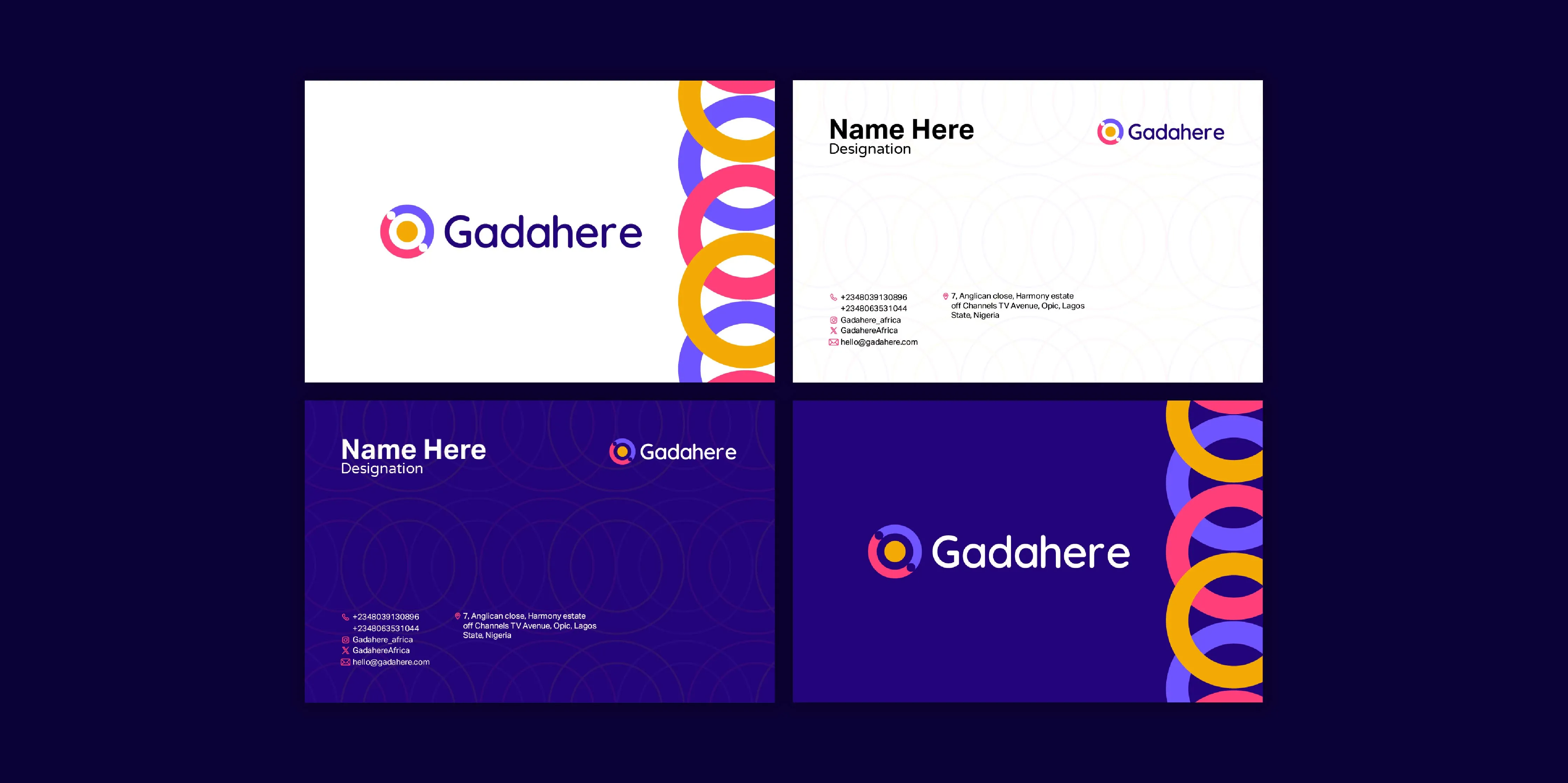
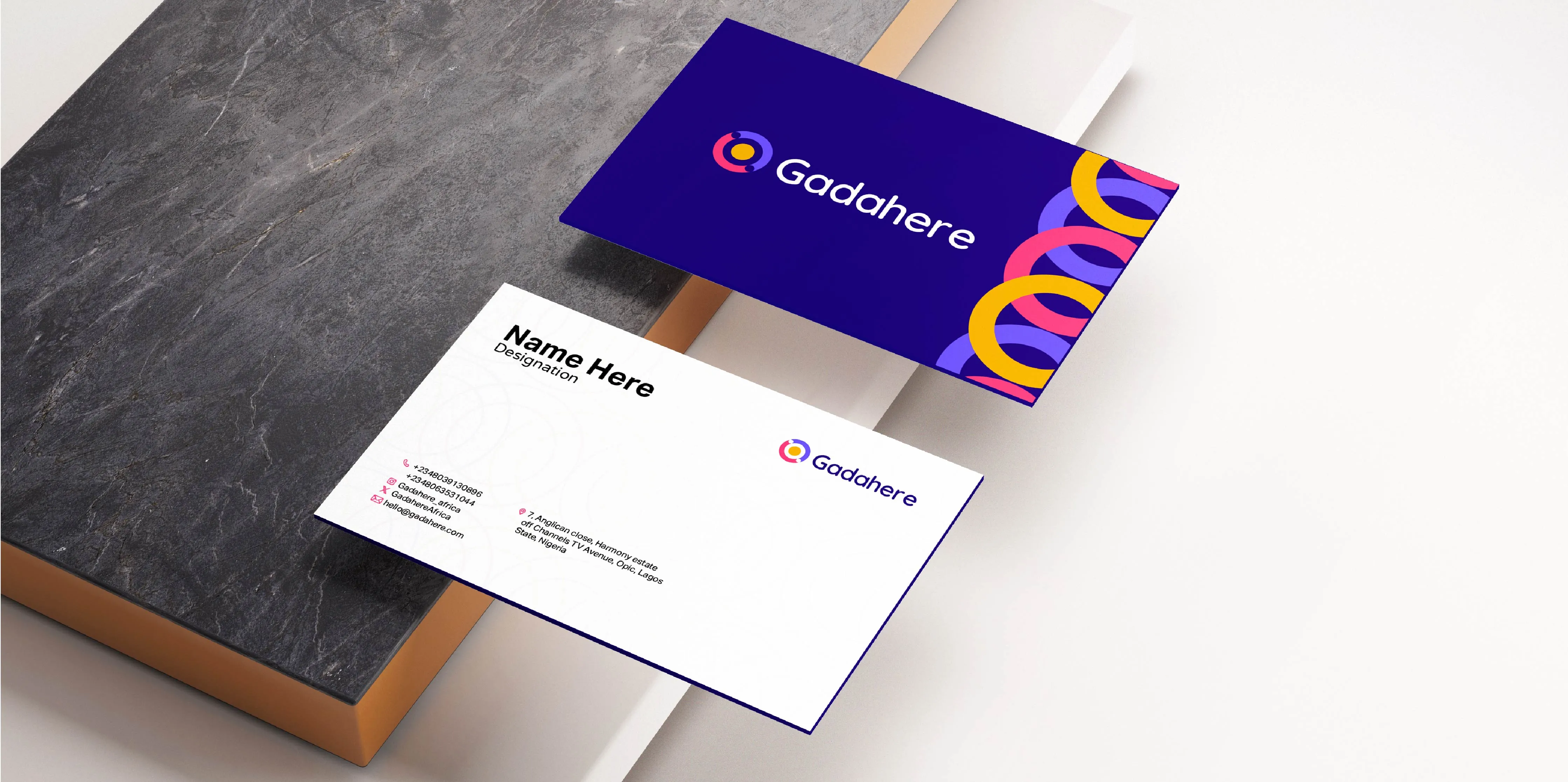
GadaHere
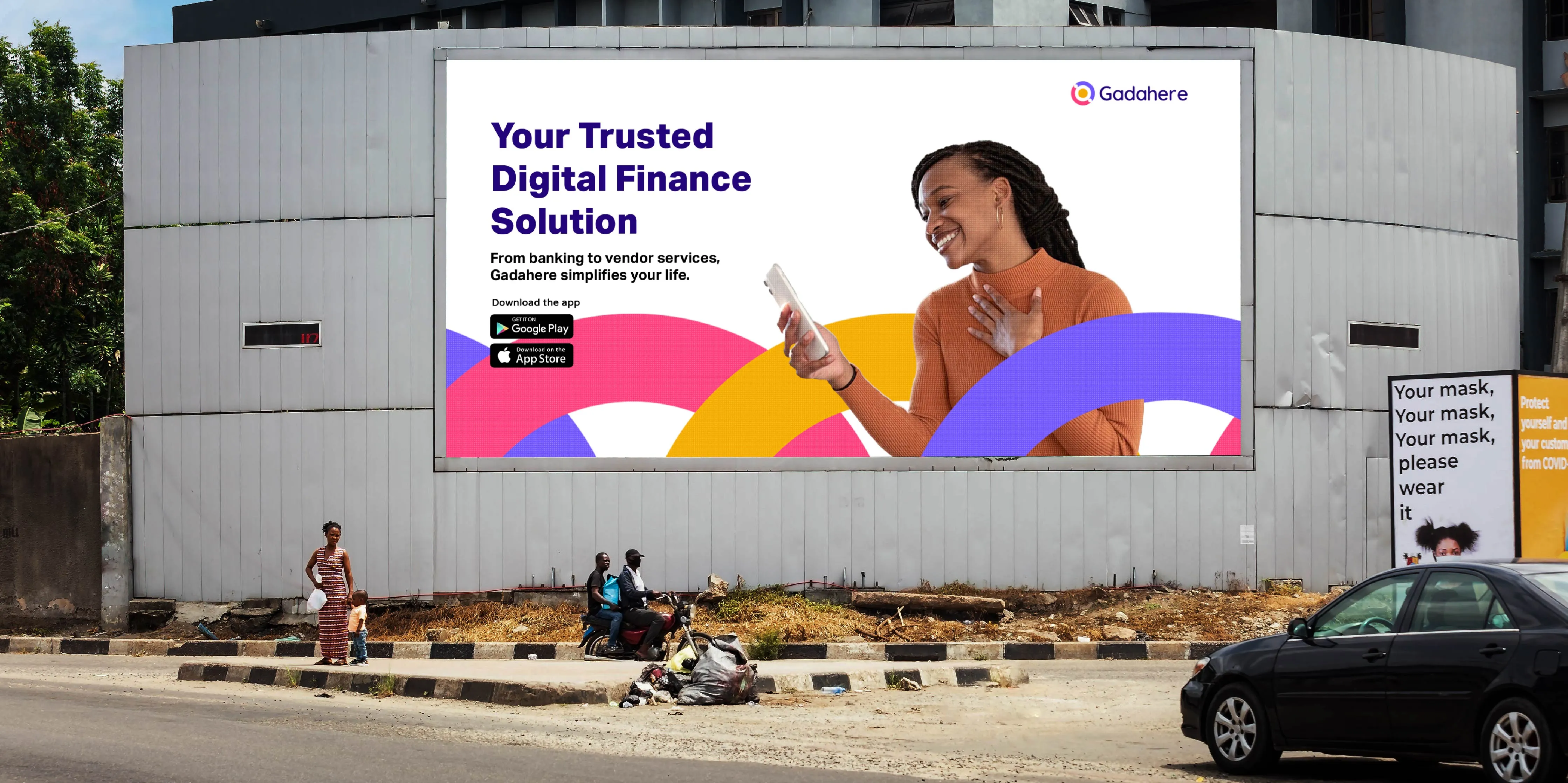
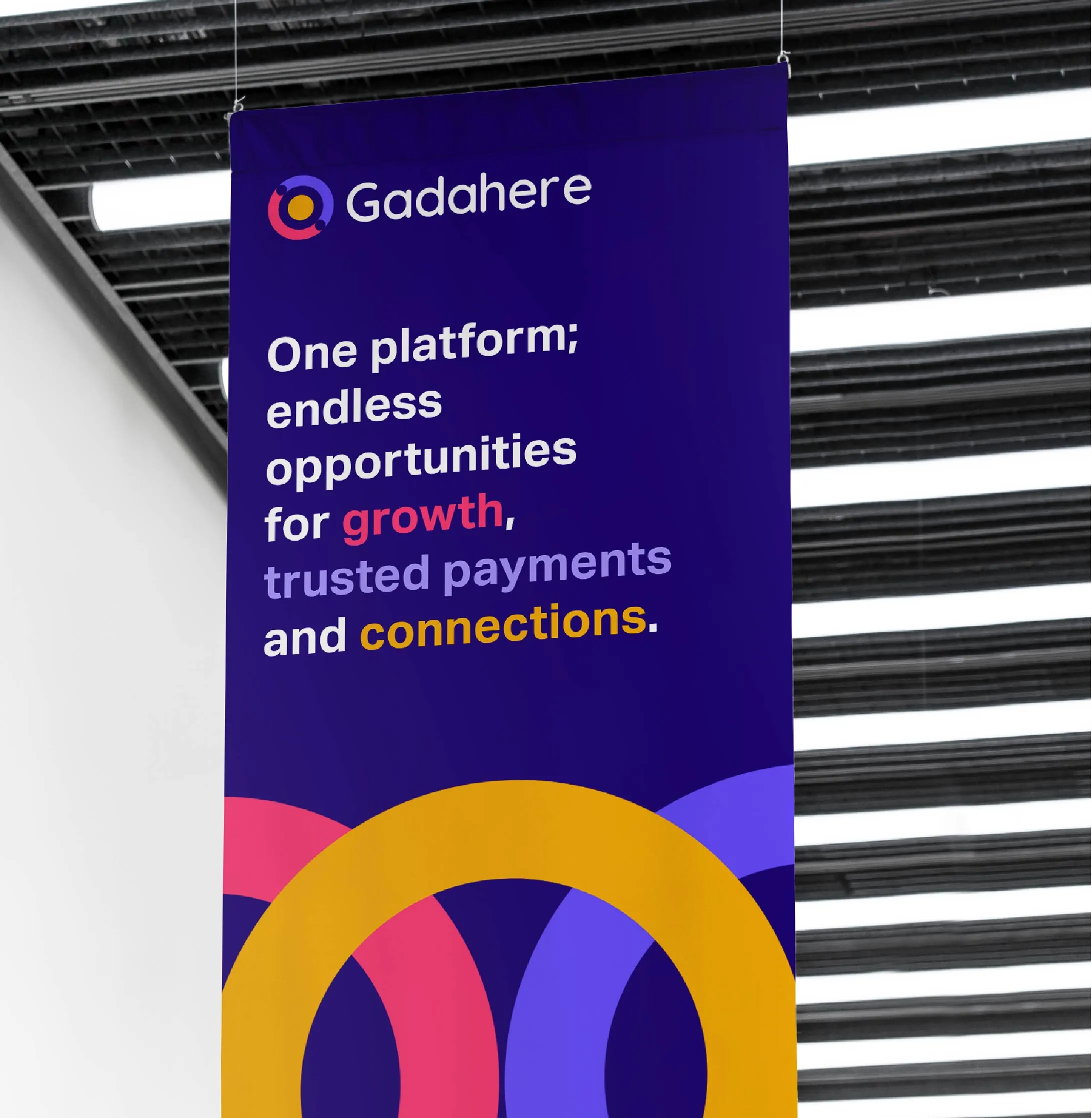
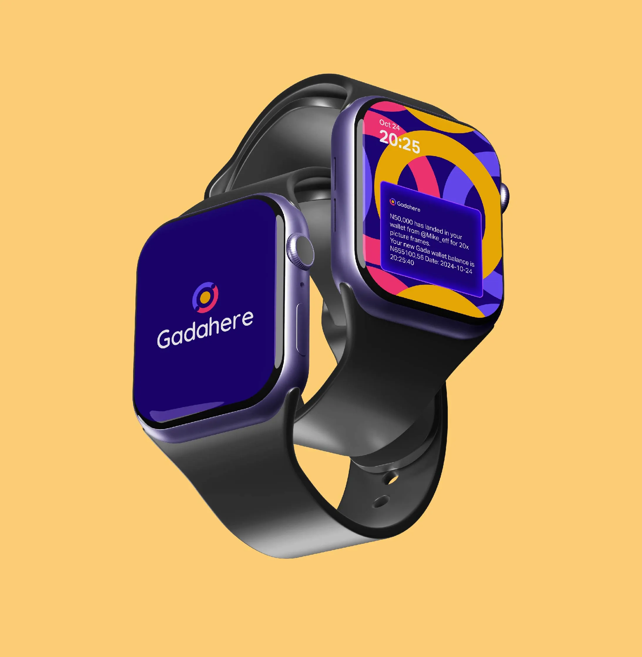
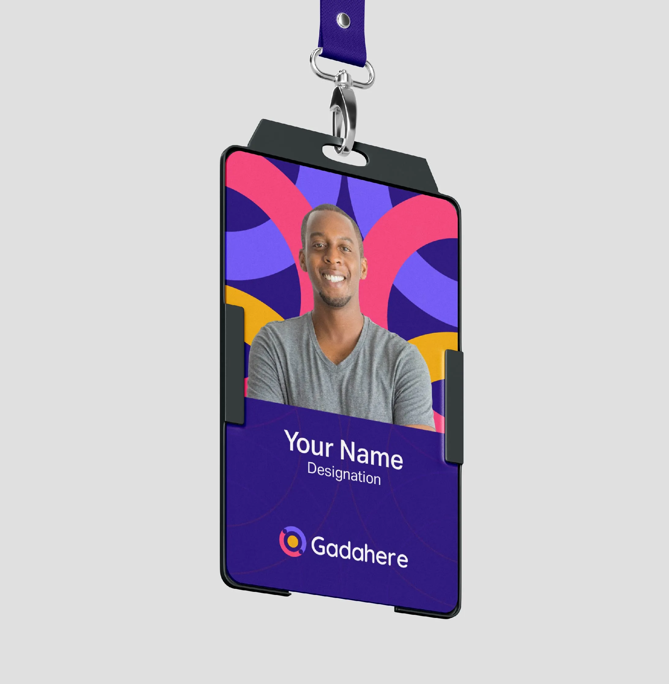
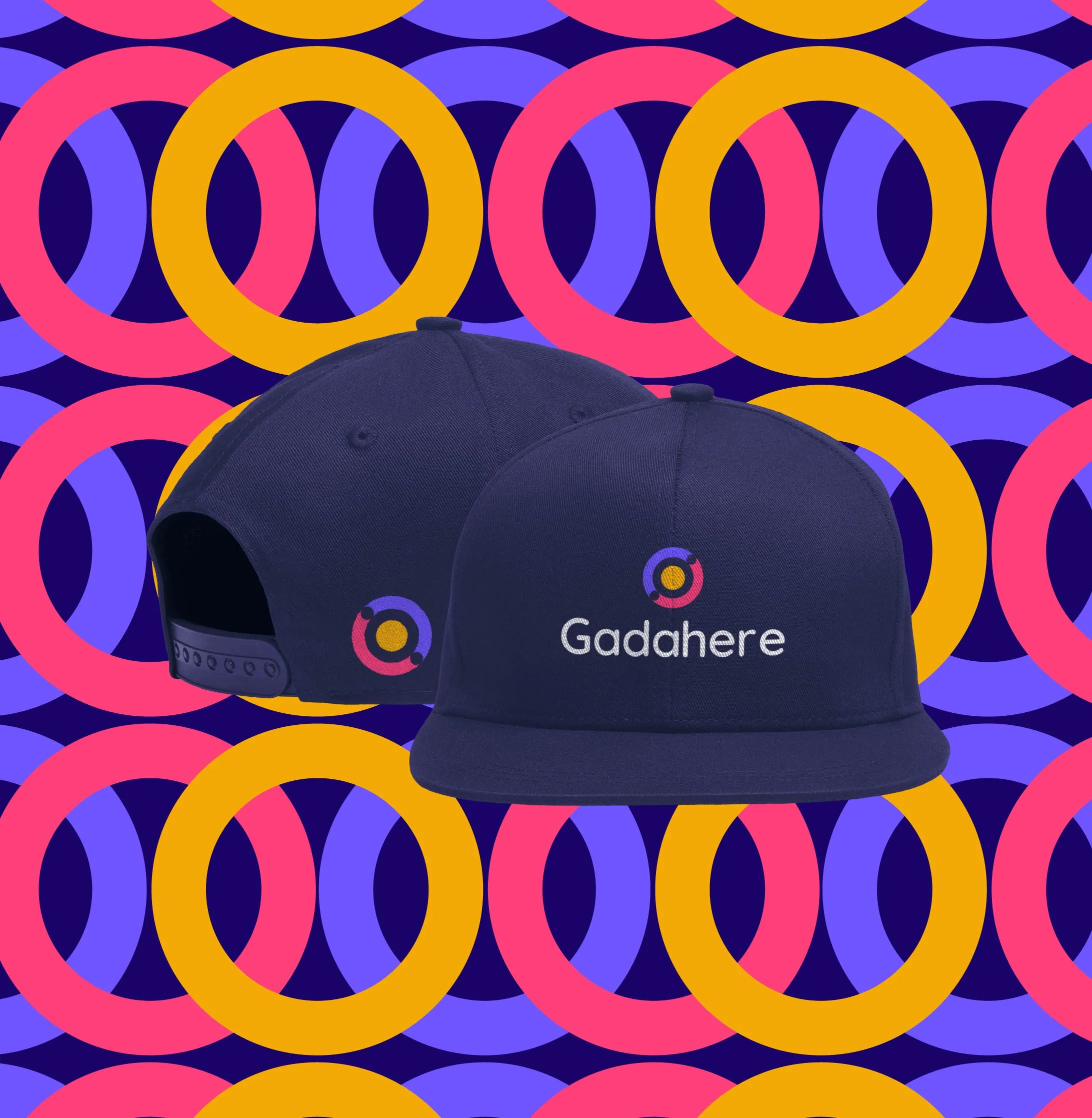
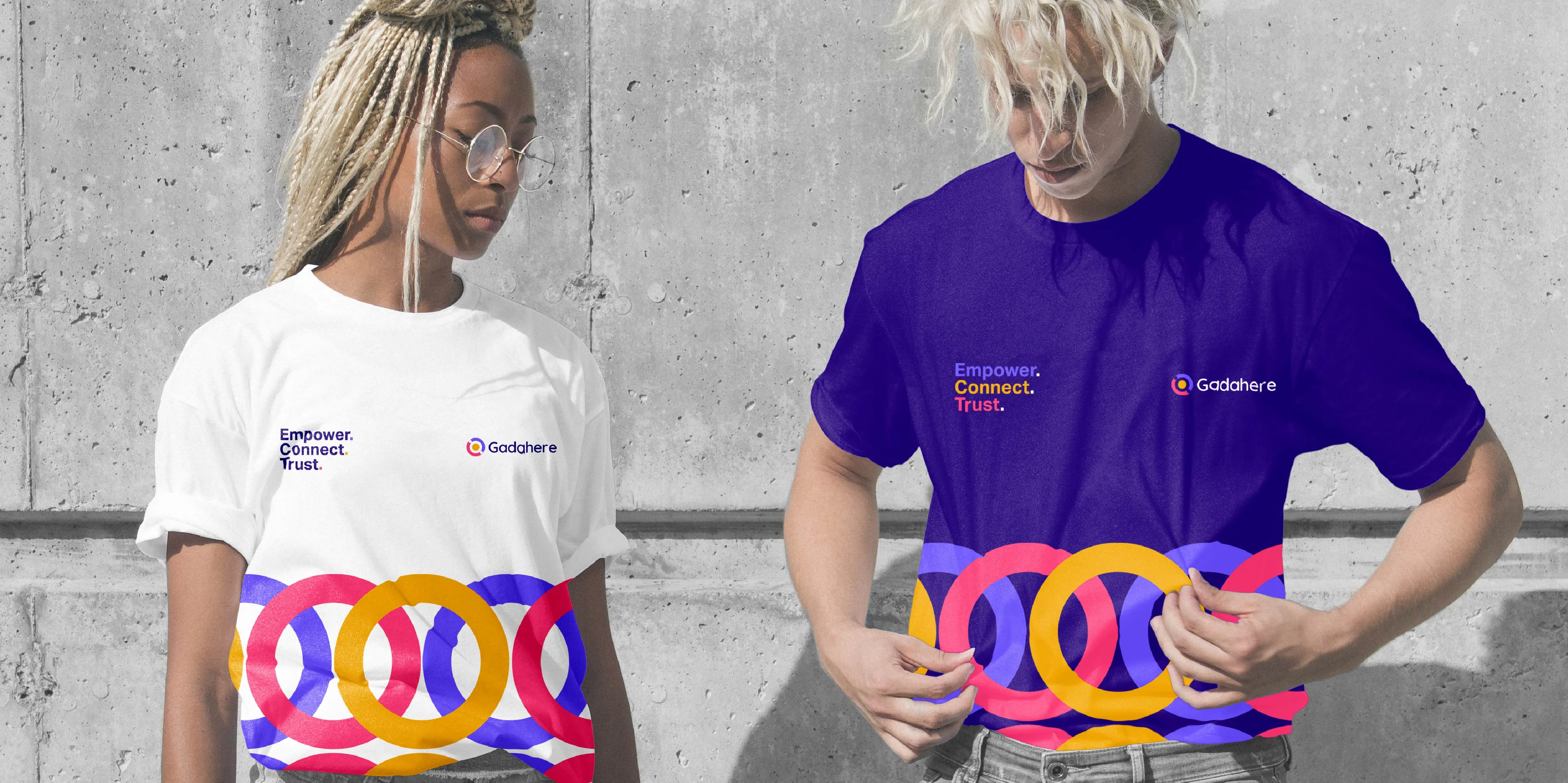
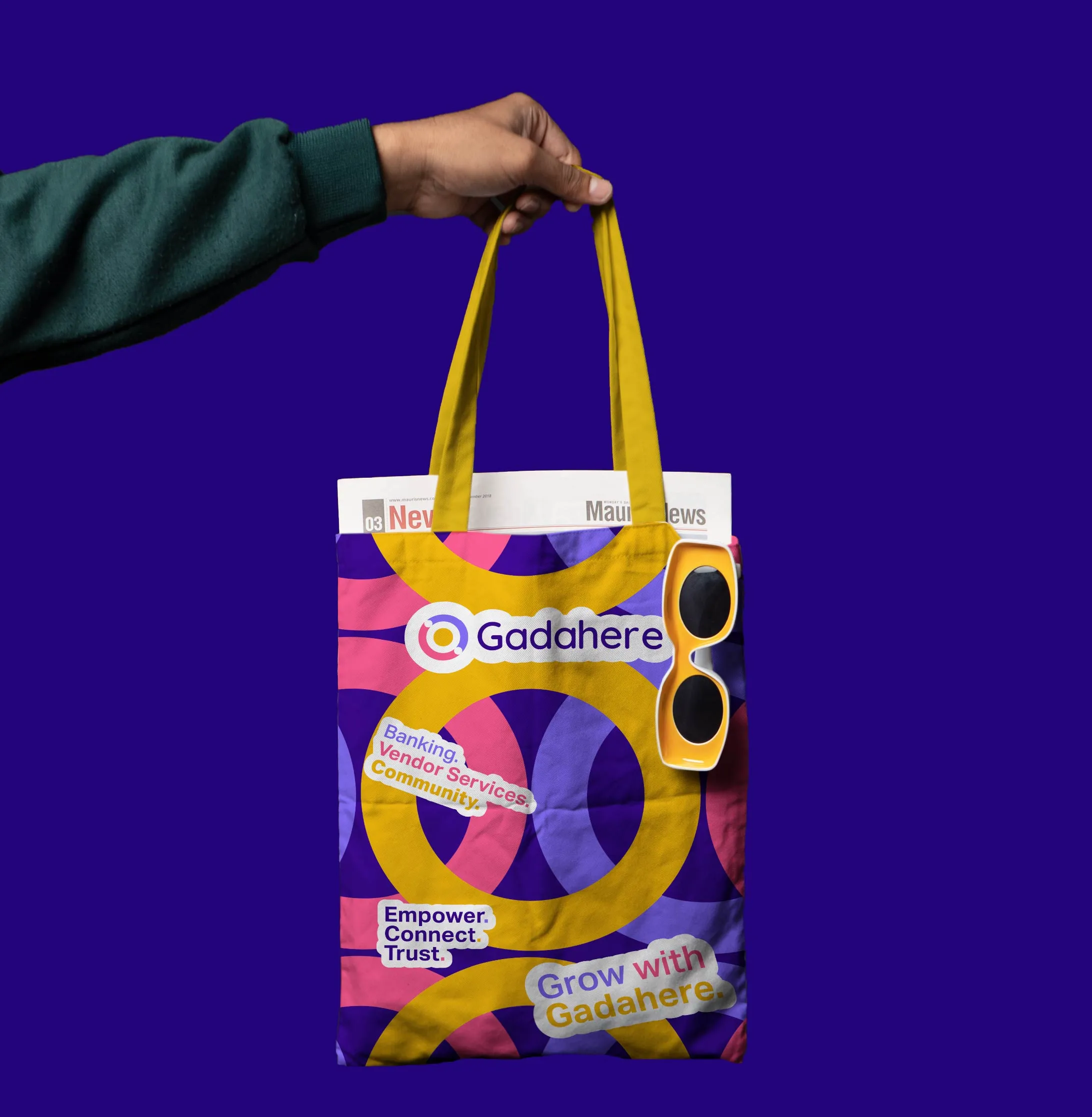
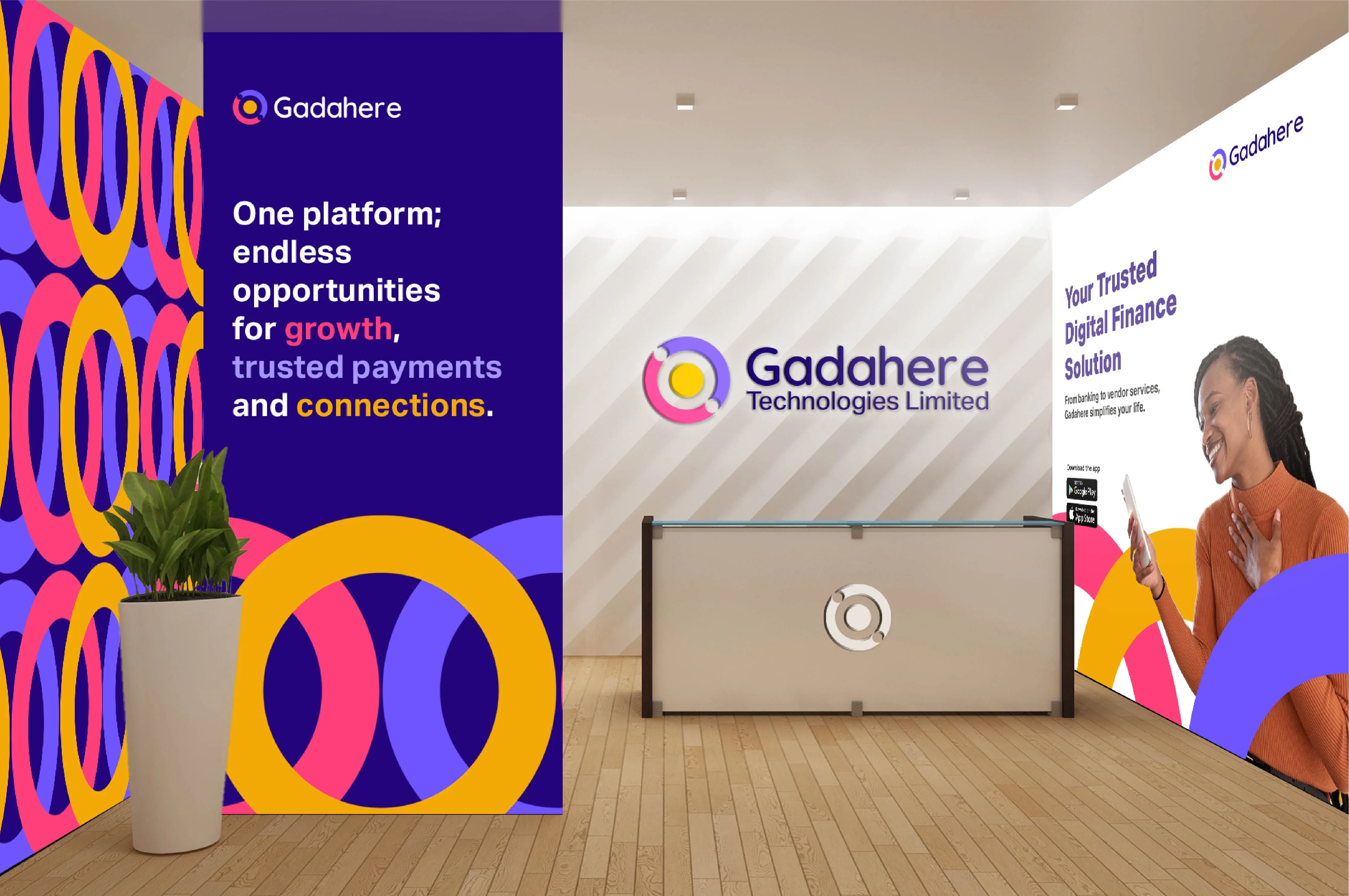
GadaHere is a digital platform that brings together financial transactions, vendor services and community interaction in one secure space. The challenge was building a brand that felt warm and community-first while still earning the kind of trust a fintech platform needs.
I worked directly with their team to develop the full visual identity. The logo, colour palette, typography and brand guidelines were all built together as one connected system so that every touchpoint feels consistent and intentional.
YEAR:
2024
PROJECT SCOPE:
Logo Design
Brand Identity
ROLE:
Brand Designer
Creative Director
INDUSTRY:
Community + Fintech
View on Behance ↗
Logo Rationale
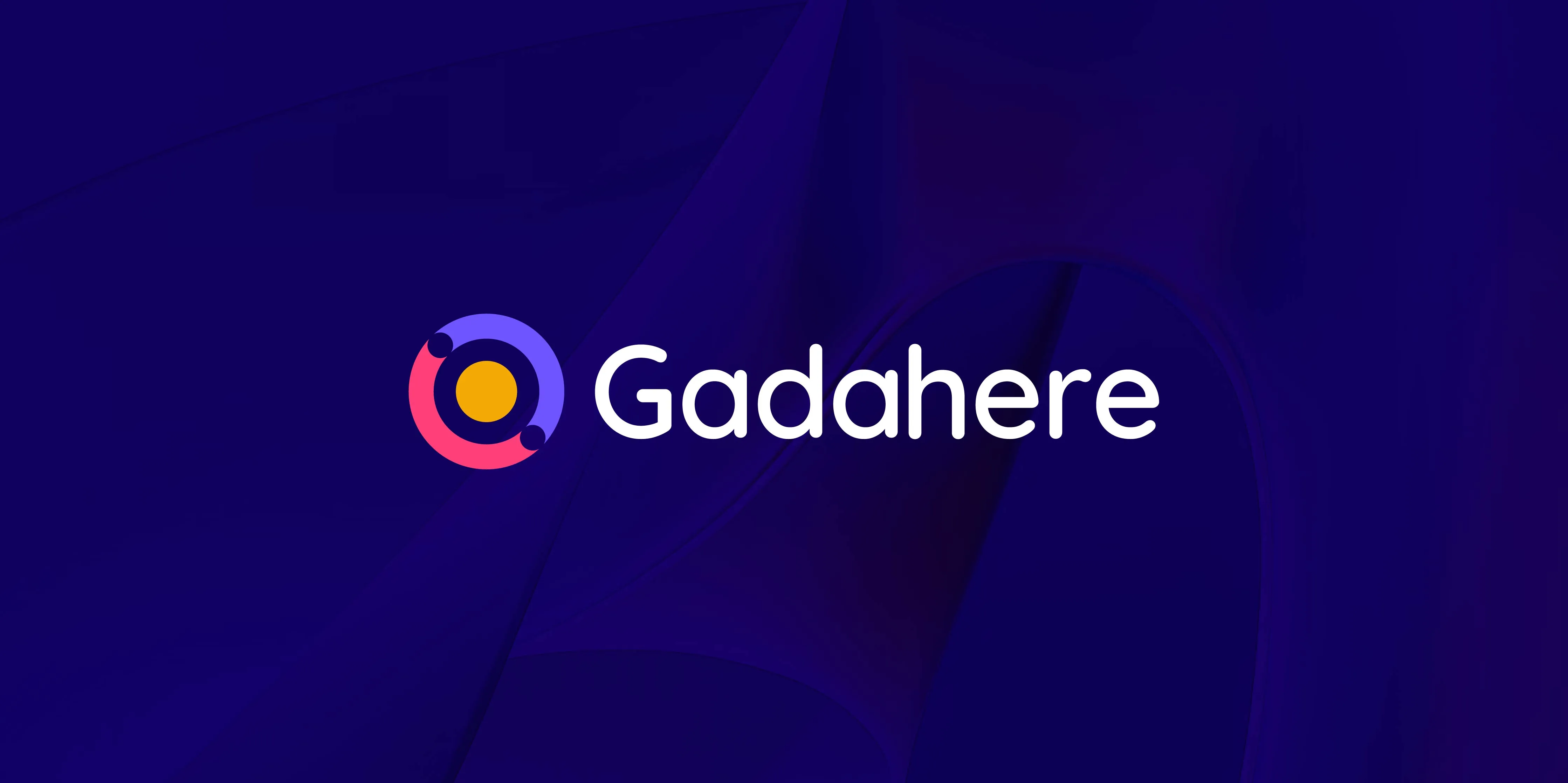
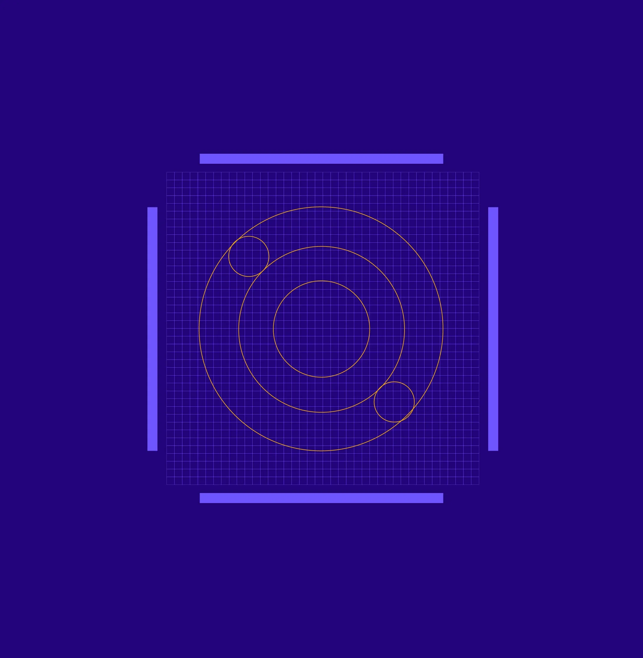
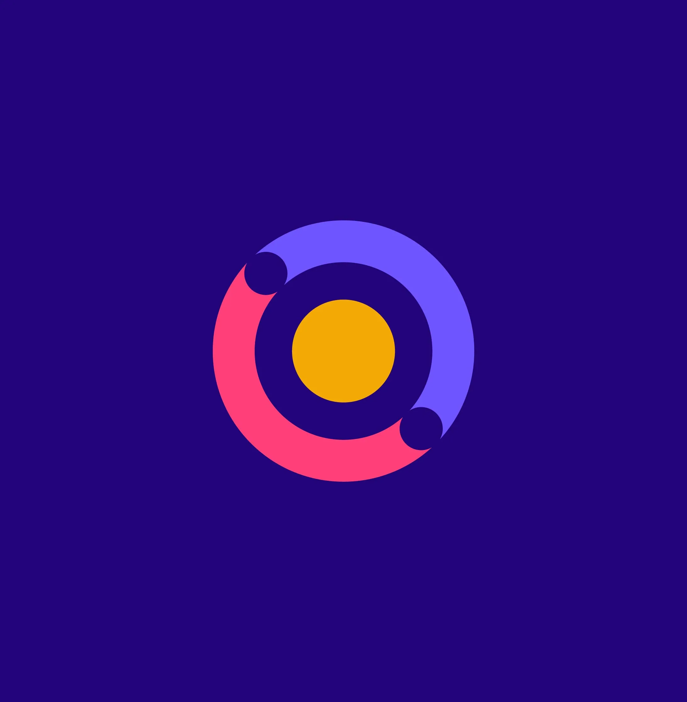
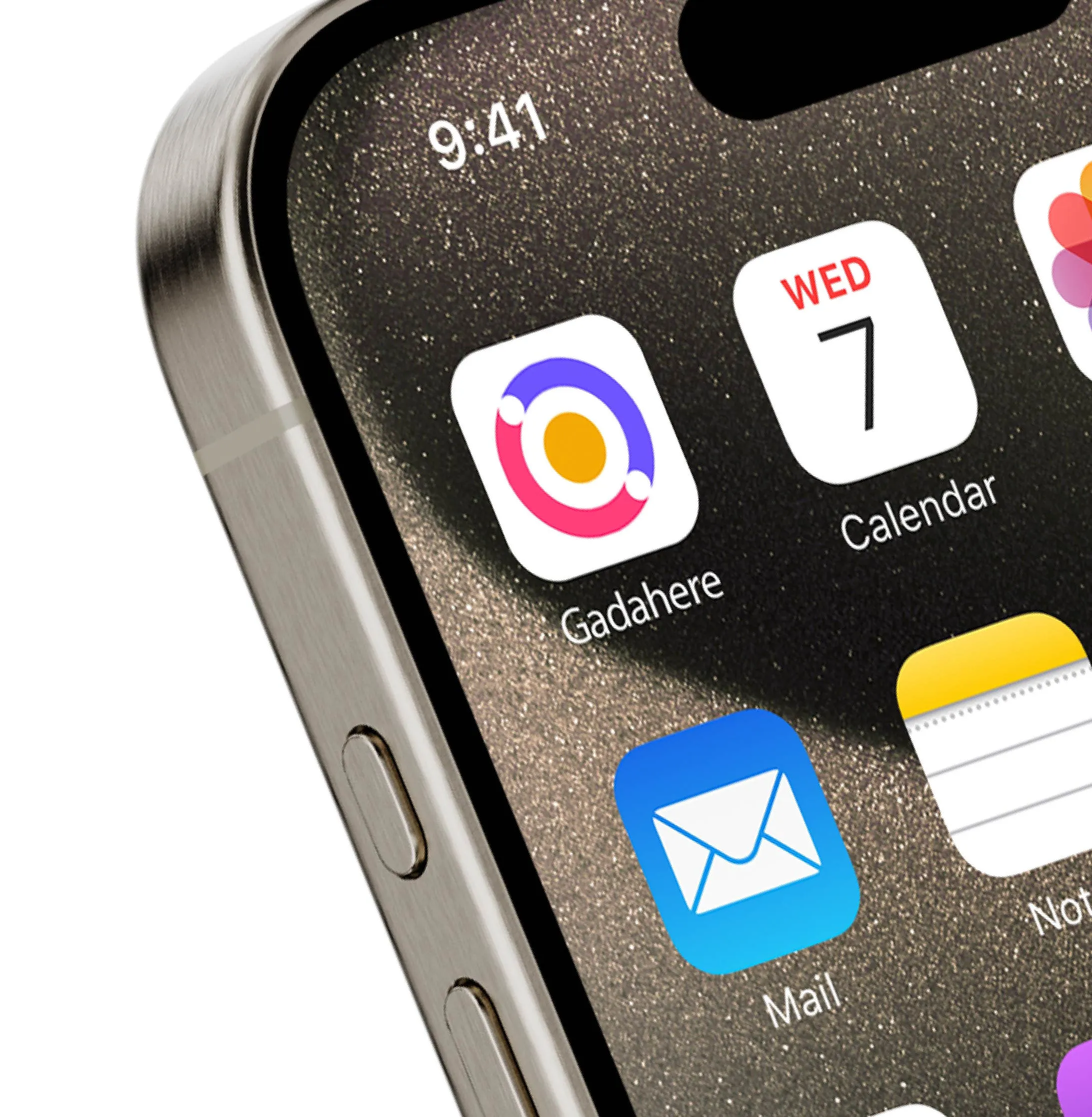
I built the GadaHere logo around community, trust, and collaboration. The circular structure was a deliberate choice to communicate unity and inclusion, core to what GadaHere is as a platform.
The innermost circle represents the community itself, the central point where all connections and transactions meet.
The outer circles wrap around it representing users and vendors, expressing protection and inclusiveness.
What ties it together is the embrace. The full mark reads as two figures coming together, reinforcing trust and safety without a single word. That to me is when a logo is doing its job.
Colors
Gada Bold Pink
#FF3F79
Gada Vibrant Purple
#6C54FB
Gada Deep Yellow
#F2A805
Gada Deep Purple
#23047C
Want something
like this?
Tell me about your brand. I will figure
out what it needs and how to get there.

GadaHere
Colors
Gada Bold
Pink
#FF3F79
Gada Vibrant
Purple
#6C54FB
Gada Deep
Yellow
#F2A805
Gada Deep
Purple
#23047C
Logo Rationale
I built the GadaHere logo around community, trust, and collaboration. The circular structure was a deliberate choice to communicate unity and inclusion, core to what GadaHere is as a platform.
The innermost circle represents the community itself, the central point where all connections and transactions meet.
The outer circles wrap around it representing users and vendors, expressing protection and inclusiveness.
What ties it together is the embrace. The full mark reads as two figures coming together, reinforcing trust and safety without a single word. That to me is when a logo is doing its job.
GadaHere is a digital platform that brings together financial transactions, vendor services and community interaction in one secure space. The challenge was building a brand that felt warm and community-first while still earning the kind of trust a fintech platform needs.
I worked directly with their team to develop the full visual identity. The logo, colour palette, typography and brand guidelines were all built together as one connected system so that every touchpoint feels consistent and intentional.
View on Behance ↗
YEAR:
2024
PROJECT SCOPE:
Logo Design
Brand Identity
ROLE:
Brand Designer
Creative Director
INDUSTRY:
Community + Fintech
Want something
like this?
Tell me about your brand. I will figure
out what it needs and how to get there.
GadaHere
GadaHere is a digital platform that brings together financial transactions, vendor services and community interaction in one secure space. The challenge was building a brand that felt warm and community-first while still earning the kind of trust a fintech platform needs.
I worked directly with their team to develop the full visual identity. The logo, colour palette, typography and brand guidelines were all built together as one connected system so that every touchpoint feels consistent and intentional.
YEAR:
2024
PROJECT SCOPE:
Logo Design
Brand Identity
ROLE:
Brand Designer
Creative Director
INDUSTRY:
Community + Fintech
View on Behance ↗
Colors
Gada Bold
Pink
#FF3F79
Gada Vibrant
Purple
#6C54FB
Gada Deep
Yellow
#F2A805
Gada Deep
Purple
#23047C
Logo Rationale
I built the GadaHere logo around community, trust, and collaboration. The circular structure was a deliberate choice to communicate unity and inclusion, core to what GadaHere is as a platform.
The innermost circle represents the community itself, the central point where all connections and transactions meet.
The outer circles wrap around it representing users and vendors, expressing protection and inclusiveness.
What ties it together is the embrace. The full mark reads as two figures coming together, reinforcing trust and safety without a single word. That to me is when a logo is doing its job.
Want something
like this?
Tell me about your brand. I will figure
out what it needs and how to get there.
